Turning a broken sign-up into one end-to-end journey
01 - The Problem
Sign up, then hope for the best
The original Modern Milkman sign-up flow did one thing: created an account. What happened next was left entirely to the customer. They’d land on the site, browse the products, and, if everything went well, eventually build a basket and check out. In practice, many didn’t.
The gap between creating an account and placing a first order was wide, and a significant number of new customers never crossed it. The experience had a structural flaw: sign-up and first purchase were treated as separate events separated by an open-ended browsing session with no guidance, no context, and no momentum.
t a company built around subscription and habit, that first order mattered enormously. Customers who placed it were far more likely to become long-term subscribers. Customers who didn’t rarely came back.
02 - Discovery
Where people were dropping off, and why
The data showed a clear pattern: drop-off was highest in the space between account creation and basket building. New customers were arriving, looking around, and leaving without ordering. The site assumed they’d know what to do, but most people signing up to a milkround delivery service for the first time had no frame of reference for how it worked.
Several questions went unanswered during the original sign-up experience:
Questions left unanswered
- When will my deliveries arrive?
- How does the milkround model work?
- What products are right for my household?
- How do I set up a recurring order?
- Where do I even start?
Answered by the builder
- Your driver delivers Tue, Thu & Sat by 7:30am
- Each delivery is a milkround, recurring by default
- Suggestions based on household size
- Recurring order set up as part of the flow
- Guided from step 1 to checkout
The insight was straightforward: if we could answer those questions as part of the sign-up itself, and take the customer all the way through to checkout in one guided journey, drop-off would fall and conversions would rise.
03 - Design
One flow. Account to checkout without leaving.
The solution was a five-step progress-based sign-up flow that guided new customers from account creation to their first completed order in a single session. A progress bar at the top made the journey visible from the start, customers could see exactly where they were and how far they had to go.
Step 1. Account
Standard account creation, name, email, address, password. The progress bar set expectations immediately. Five steps, clearly laid out. Customers could see the finish line from the start.
Step 2. Delivery
Customers were shown their local driver's delivery schedule, for example, "Your local driver delivers by 7:30am every Tuesday, Thursday and Saturday", and asked when they'd like deliveries to begin. This step made the service feel local and tangible, and committed the customer to a start date before they'd built their basket.
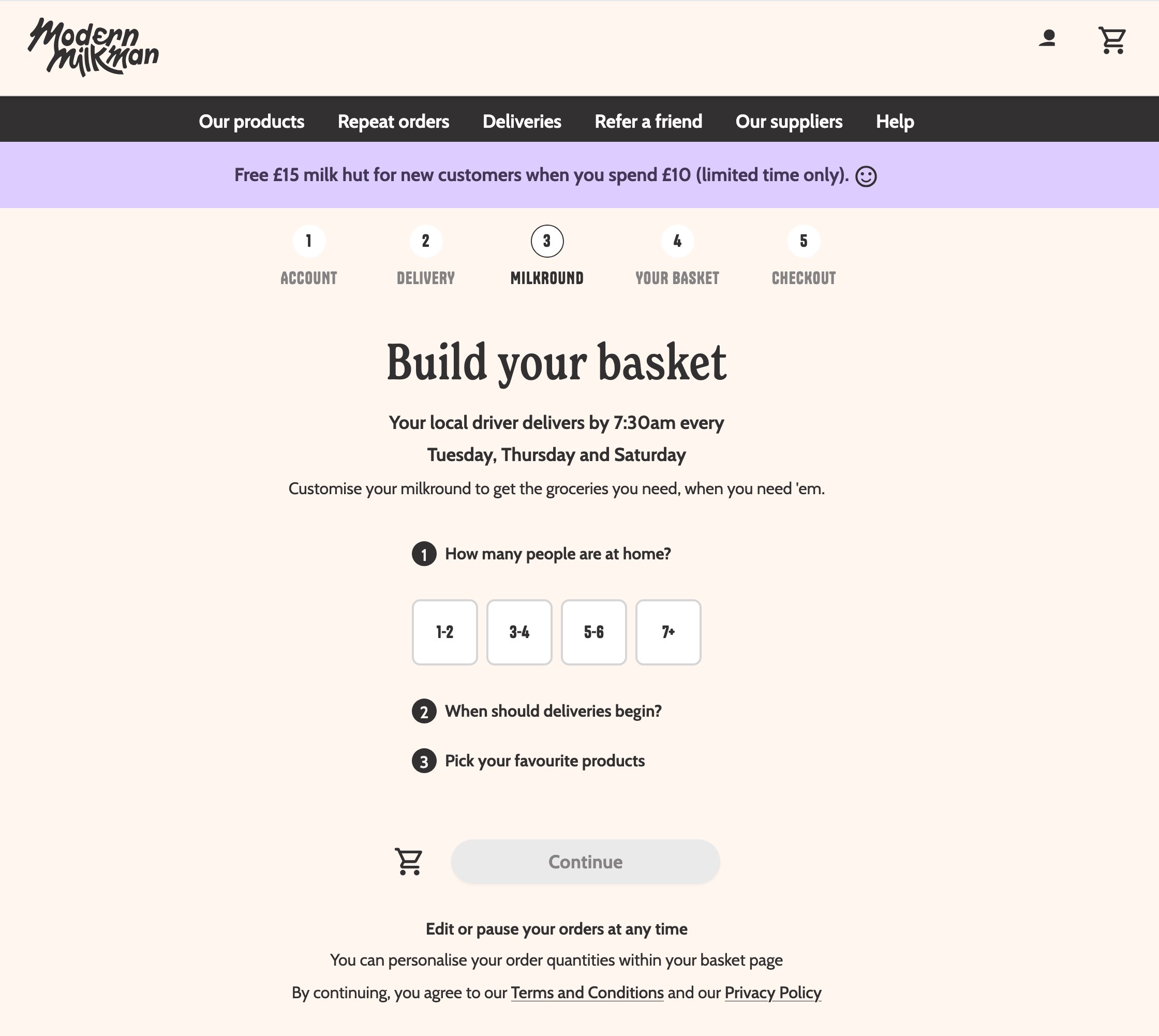
Step 3. Milkround Builder
The centrepiece of the new flow. Customers answered three questions: how many people are at home (1–2 / 3–4 / 5–6 / 7+), when deliveries should begin, and which products they'd like. Household size informed suggested quantities. Product selection gave customers a personalised starting point rather than a blank catalogue to navigate alone.
Step 4. Your Basket
Customers reviewed their suggested milkround, adjusted quantities, and added or removed items. The heavy lifting had already been done, this step was refinement, not discovery. Arriving at a populated basket rather than an empty one made the next step feel natural.
Step 5. Checkout
Standard checkout. The customer had gone from nothing to a completed first recurring order in one sitting, without leaving the flow, without navigating the site, without having to figure anything out themselves.
04 - Constraints & Trade-offs
Shipping an MVP, not a masterpiece
The first version of the Milkround Builder was deliberately scoped to test one hypothesis: would guiding customers through a structured flow improve conversion compared to the freeform browse-and-build experience? The answer came back quickly in the data.
From there the team iterated, adding, removing, and refining elements based on real usage patterns. Some steps that seemed useful in design proved unnecessary once customers were actually moving through the flow. Others needed friction removed. A few assumptions about what customers needed in the builder turned out to be wrong in practice, and the data made those corrections clearly.
The phased approach meant every subsequent decision was grounded in evidence rather than opinion, which is the only environment in which good product iteration actually happens.
05 - Outcomes
Consistent growth from the moment it launched
Sign-ups increased week on week from launch. Connecting account creation directly to first checkout, without the customer needing to navigate away, come back, find products, and decide to proceed, proved to be the meaningful change the drop-off data had been pointing toward.
Week-on-week sign-up growth
From launch, new customer sign-ups increased consistently. Removing the gap between account creation and first order removed the biggest single point of drop-off in the acquisition funnel.
Drop-off reduced at the critical moment
By the time a customer completed Step 3, they had a basket, a delivery schedule, and a start date. The commitment was made. The distance between sign-up and first checkout was eliminated rather than shortened.
A better first impression
The builder educated customers on how the service worked as they moved through it. By checkout, they understood their delivery days, their driver's schedule, and how their recurring order functioned, reducing post-sign-up confusion and CS contacts.
A scalable onboarding foundation
The five-step framework became the structural basis for future sign-up improvements, including the later integration of the membership step, because the architecture was already in place to add and remove steps as the product evolved.
06 - Reflections
What I took away from this project
- The biggest conversion wins often come from joining up existing steps rather than adding new ones. Sign-up and first checkout already existed, connecting them in one flow was the insight.
- Progress indicators do real work. Showing customers where they are in a journey reduces anxiety and increases completion. The five-step bar was a small design decision with measurable impact.
- Household size as a starting point for personalisation is underrated. It's a low-friction question that unlocks meaningfully tailored suggestions, customers don't feel interrogated, but the output feels relevant to them.
- MVP and iterate is only effective if you're actually measuring. The week-on-week sign-up data made the case for continued investment and informed every subsequent iteration.
- Onboarding is the product's first impression and its best chance to create a habit. Getting a customer to their first completed order is the most important conversion in a subscription business, everything else follows from it.